Service 04 / 11
Maintainable, accessible React component systems and product UIs that your team can extend for years — not a tangle of one-off screens.
Overview
What you get.
- Reusable systems
- Type safe
- Accessible
Good React is mostly about boundaries: small composable components, predictable state and a clear data layer. We design those boundaries first, so features stay cheap to add as the product grows.
We build with strict TypeScript, document components in Storybook and cover behaviour with tests, so design and engineering share one source of truth.
Most React projects slow down not because React is slow, but because component boundaries were never designed. Props balloon, state leaks across screens and every change risks breaking something unrelated. We invest early in the structure that prevents this.
Whether you need a new product UI, a shared component library across several apps, or a careful rescue of an inherited codebase, we work in small, reviewable increments with tests so you can see progress and risk at every step.
Why it matters
The problem we solve.
UI inconsistency compounds
Without a shared component layer every screen reinvents buttons, spacing and states — slowing teams and confusing users.
Accessibility is not optional
Accessible interfaces reach more customers, reduce legal exposure and tend to be better for everyone.
Velocity depends on structure
Well-factored components and types let new engineers ship safely in days rather than weeks.
Rewrites are expensive
Incremental modernisation delivers value continuously instead of freezing the roadmap for a big-bang rewrite.
Scope of work
What’s included.
Component library
Reusable, themeable, accessible primitives documented in Storybook.
Design system implementation
Figma tokens mapped to code with variants, states and dark mode.
State & data management
TanStack Query, Zustand or Redux Toolkit — chosen for the problem, not by habit.
Forms & validation
React Hook Form with schema validation (Zod) and accessible error handling.
Accessibility (WCAG 2.2 AA)
Keyboard navigation, focus management, ARIA and screen-reader testing.
Legacy modernisation
Class components, jQuery and old SPAs refactored to modern React incrementally.
Ideal clients
Who this is for.
Product teams
Companies building a web app that needs a scalable, consistent UI layer.
Multi-product organisations
Groups that need one design system powering several apps and brands.
Startups scaling their frontend
Teams whose early prototype is starting to slow every release.
Teams with legacy code
Projects stuck on class components, jQuery or outdated tooling.
How the project runs
Our process.
Transparent milestones, weekly demos and one point of contact from kickoff to launch.
- 01
UI audit
Inventory of screens, patterns and inconsistencies to define the component taxonomy.
- 02
Design tokens & primitives
Colour, type and spacing tokens, then atomic components (buttons, inputs, modals).
- 03
Composition
Patterns and feature components assembled from primitives, with isolated stories.
- 04
State & data layer
Server state, client state and URL state separated and typed end to end.
- 05
Testing
React Testing Library, visual regression and a11y checks in CI.
- 06
Documentation & handover
Storybook, contribution guide and a walkthrough for your team.
Quality bar
Standards we hold.
Typed from end to end
Strict TypeScript, typed props and validated API responses.
Tested behaviour
Tests focus on what users do, not implementation details, so refactors stay safe.
Accessible primitives
Keyboard support, focus handling and ARIA patterns baked into every base component.
Documented in isolation
Every component has stories showing variants, states and edge cases.
Tooling
Technology stack.
Core
State & data
Tooling
Styling
Glossary
Terms we use.
- Component composition
- Building complex UI by combining small, focused components.
- Virtual DOM / reconciliation
- React's diffing mechanism that updates only what changed.
- Memoisation
- Caching a computed result (useMemo, React.memo) to avoid needless re-renders.
- Controlled component
- A form input whose value is owned by React state.
- Storybook
- A workshop for building and documenting UI components in isolation.
- Code splitting
- Loading JavaScript on demand to keep initial bundles small.
- Hooks
- Functions like useState and useEffect that let function components manage state and side effects.
- Prop drilling
- Passing data through many component layers just to reach a deep child — usually a sign to restructure.
FAQ
Common questions.
Can you join an existing React codebase?
Yes. We start with a short code audit, agree conventions, then ship alongside your team.
Do you build design systems too?
Yes — from tokens in Figma to a published, versioned component package.
Which state library do you recommend?
Server state in TanStack Query, minimal local state, and a store only when truly shared. We avoid global state by default.
Do you work with our designers?
Yes. We map Figma variables and components directly into code so designers and engineers stay in sync.
How do you keep bundle size down?
Route-level code splitting, lazy loading heavy widgets, avoiding oversized libraries and monitoring bundle analysis in CI.
Can you help us choose between Vite, Next.js and others?
Absolutely. We recommend based on SEO needs, hosting and team skills, and explain the trade-offs plainly.
Working together
How we engage.
Fixed-scope project
A defined scope, timeline and price agreed after discovery. Best for launches and rebuilds with clear requirements.
Monthly retainer
A dedicated block of senior time each month for continuous delivery, iteration and support.
Audit & advisory
A short, focused engagement that reviews what you have and hands you a prioritised plan to act on.
What to expect
Kickoff
A 45–60 minute call to understand goals, audience, constraints and timeline.
Written proposal
Scope, milestones, deliverables and pricing within a few working days of the call.
Weekly rhythm
A short demo and written update every week so there are never surprises.
Your input
One decision-maker, timely feedback and access to brand assets, content and accounts.
Ready for react development?
Book a callOur projects
Proof, not promises.
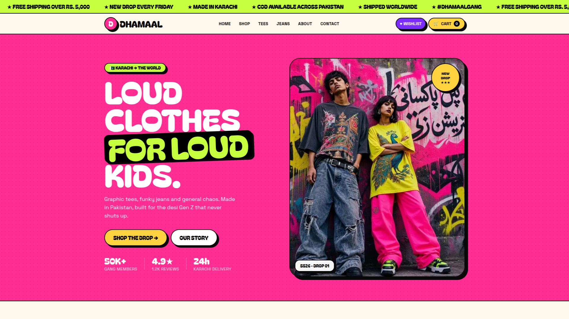
Dhamaal
Loud streetwear ecommerce — graphic tees & jeans from Karachi

Virra
Clothing brand ecommerce — Dresses, Trousers, and Accessories and more
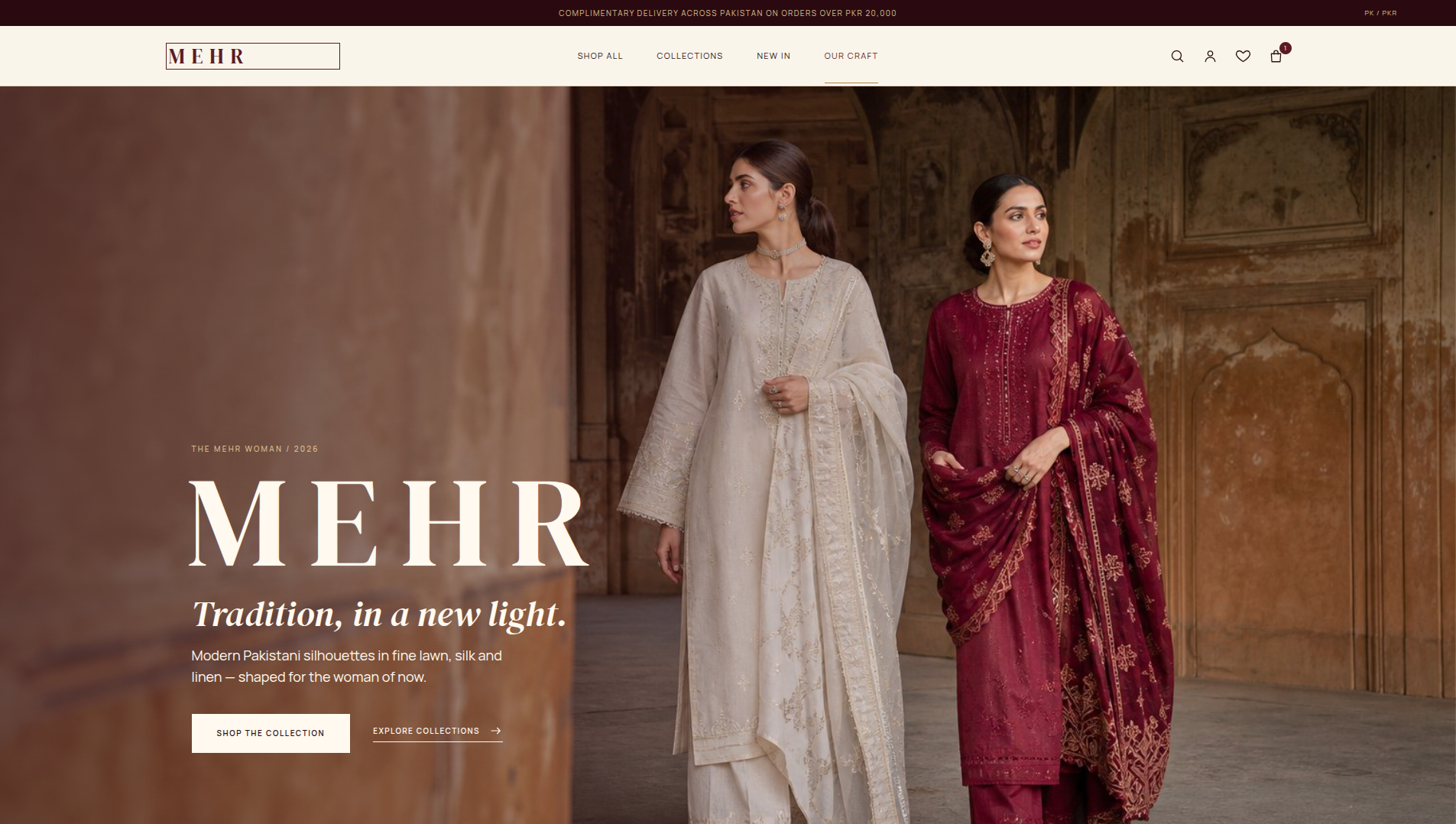
Mehr
Pakistani fashion ecommerce — premium fabrics, ready-to-wear and custom tailoring